— 2018
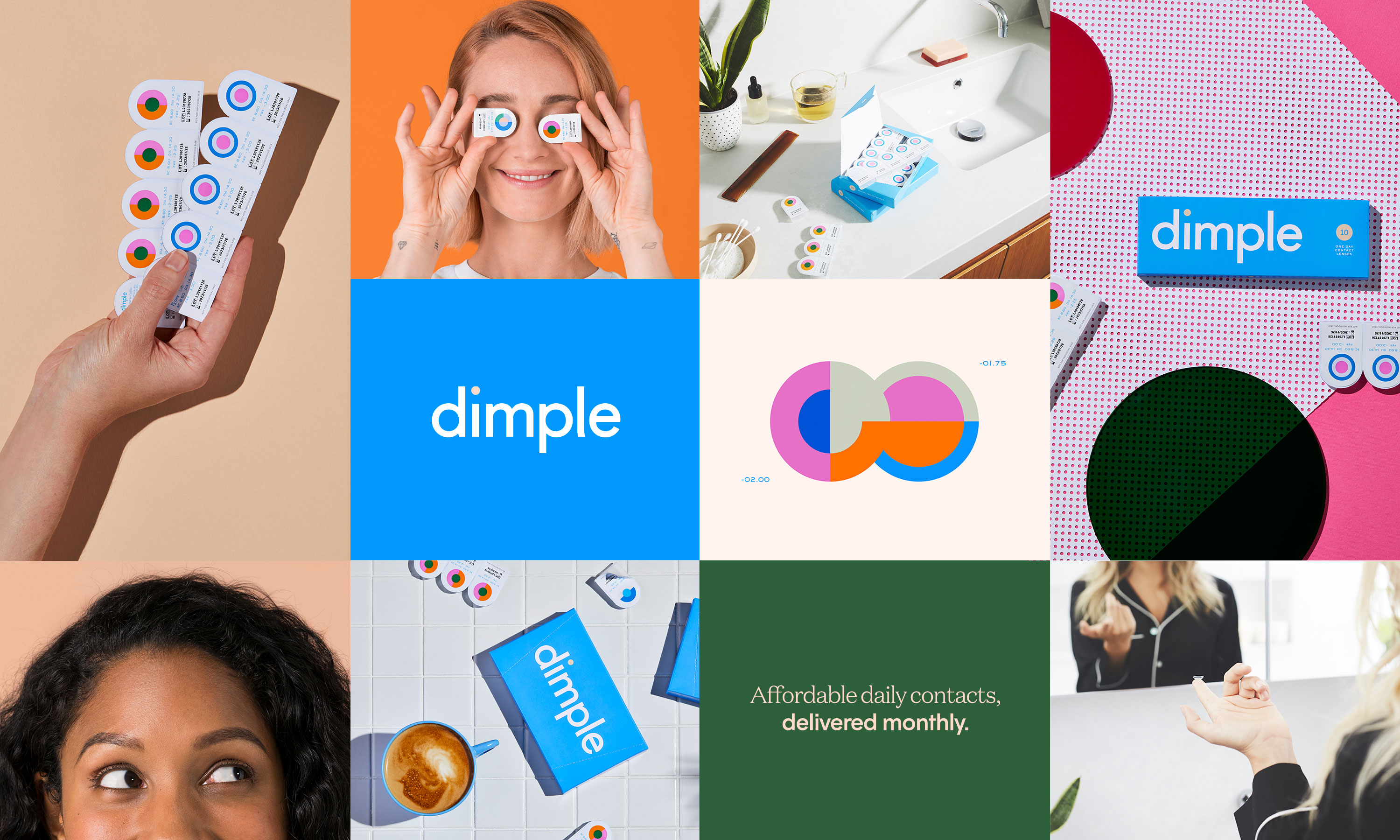
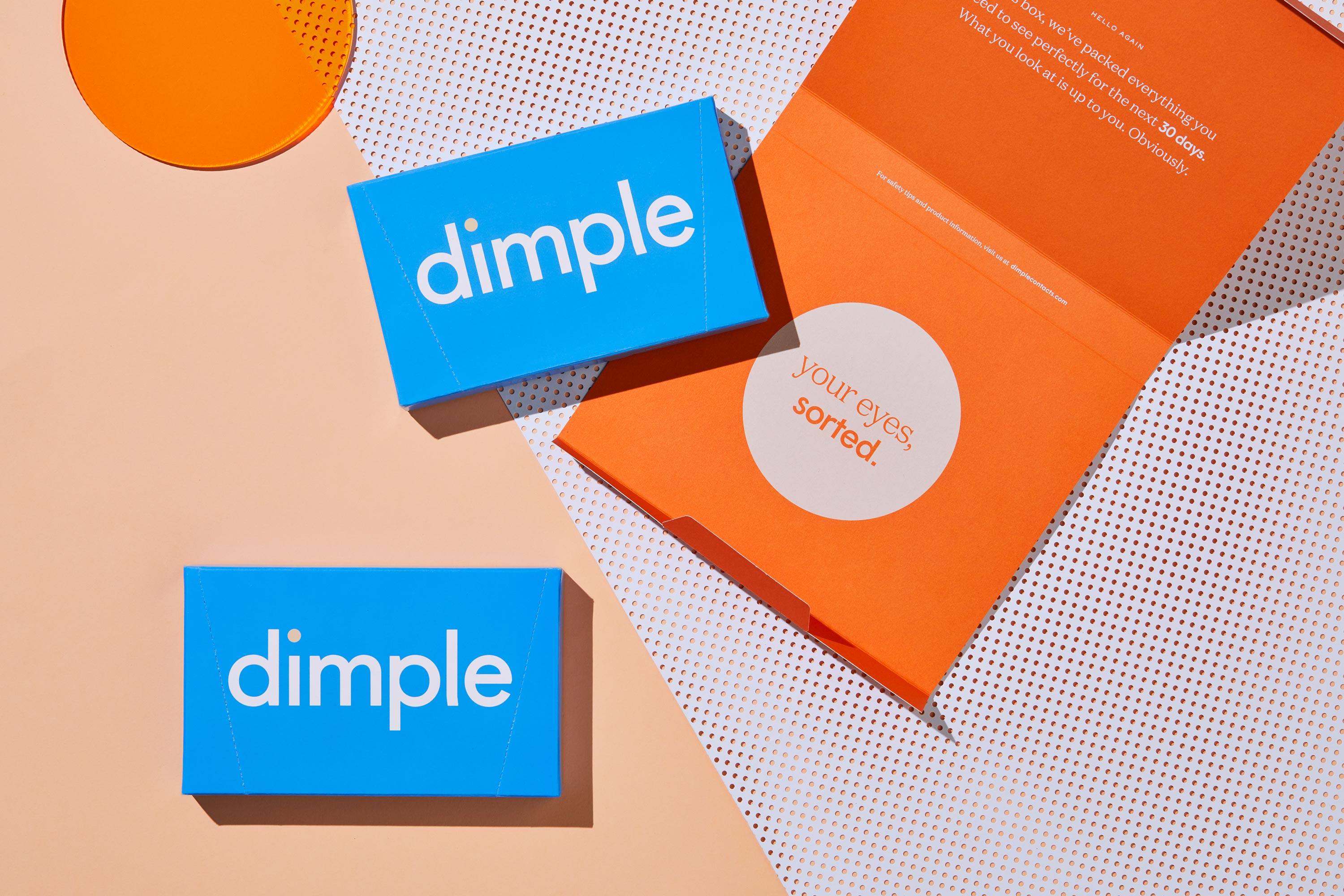
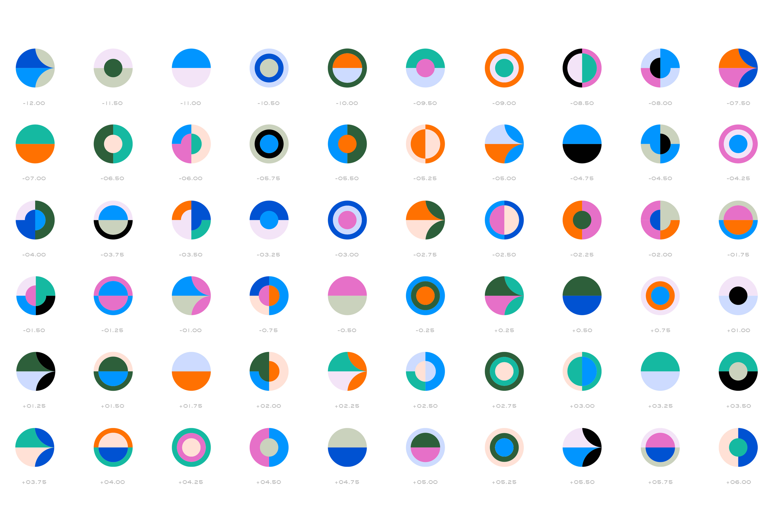
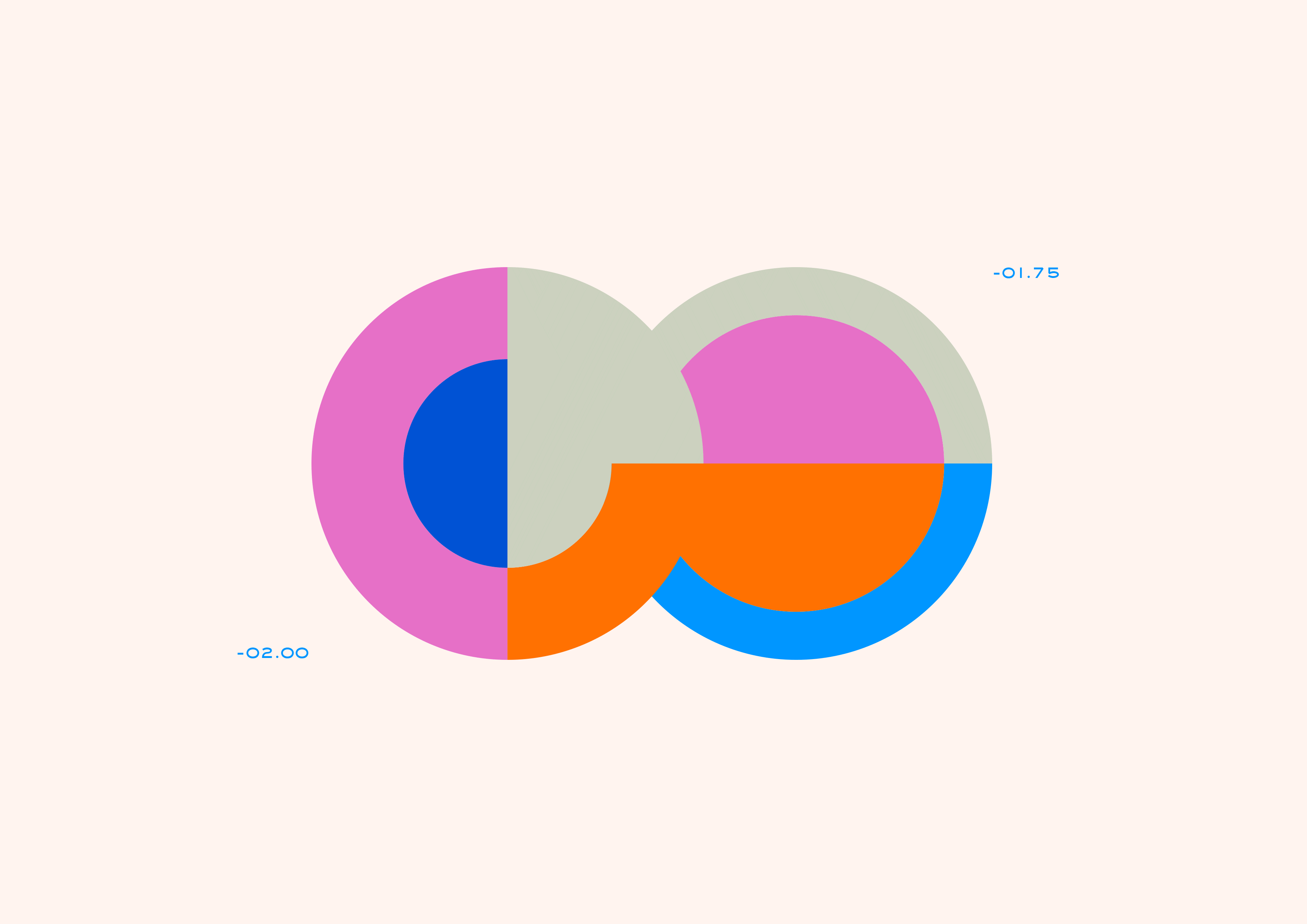
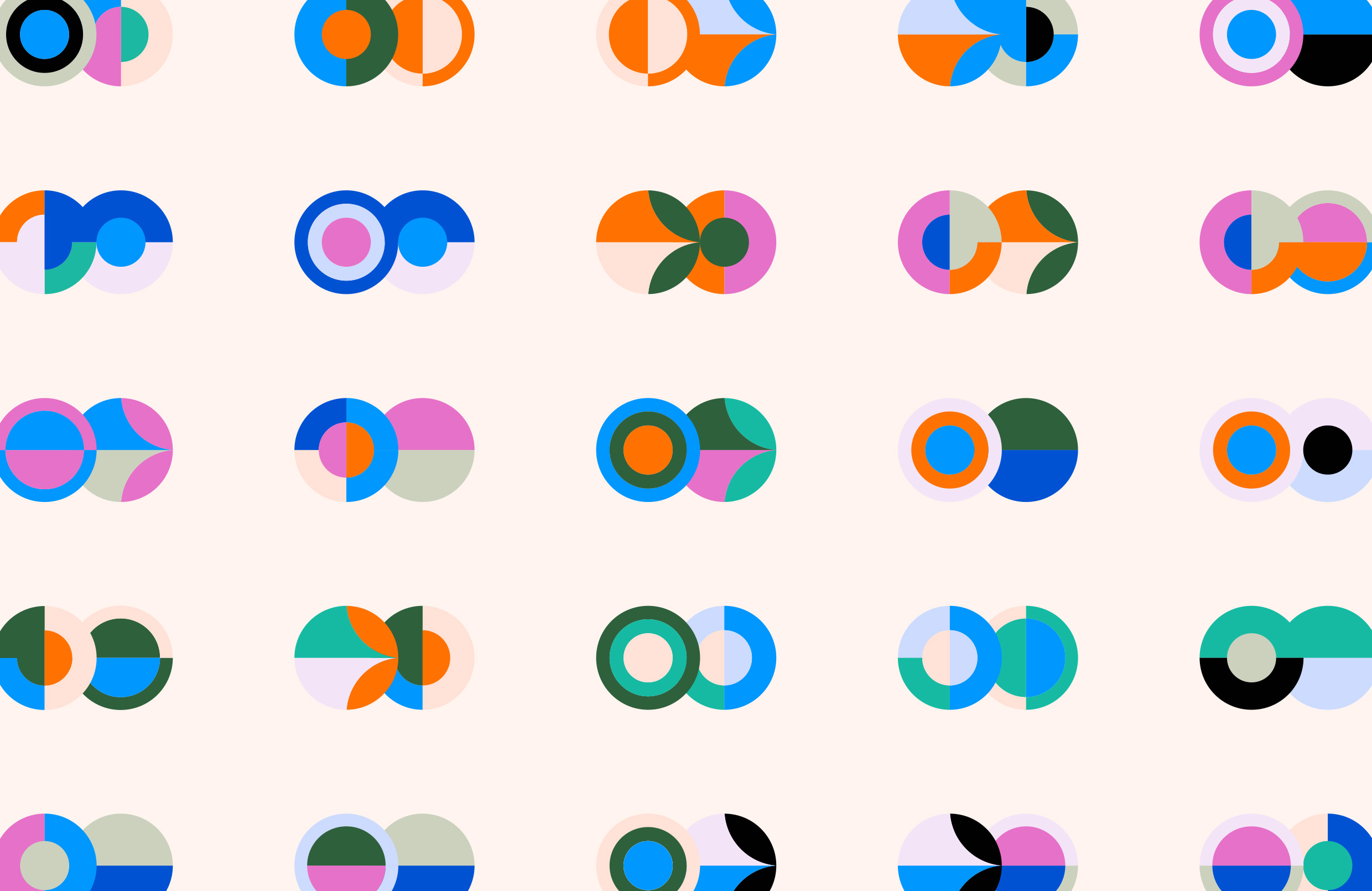
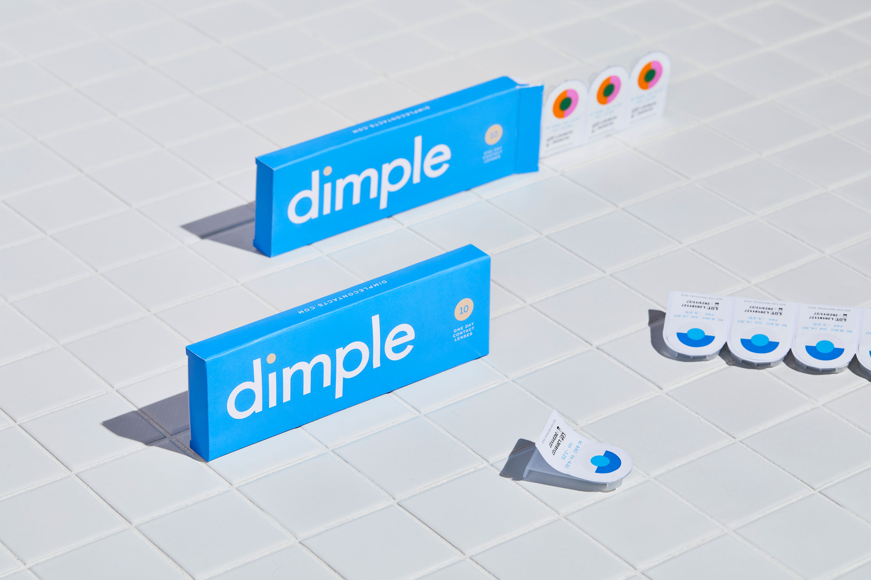
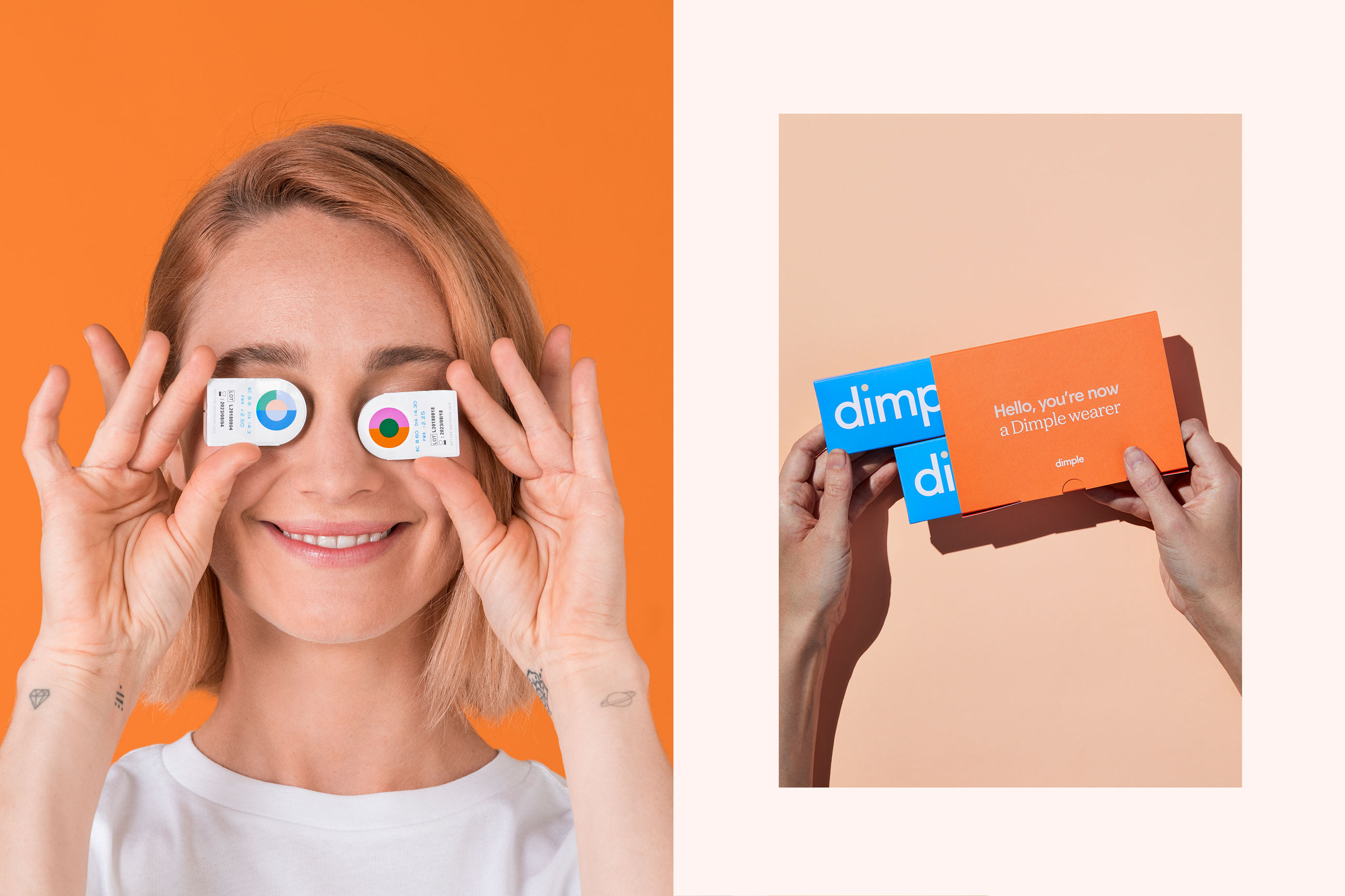
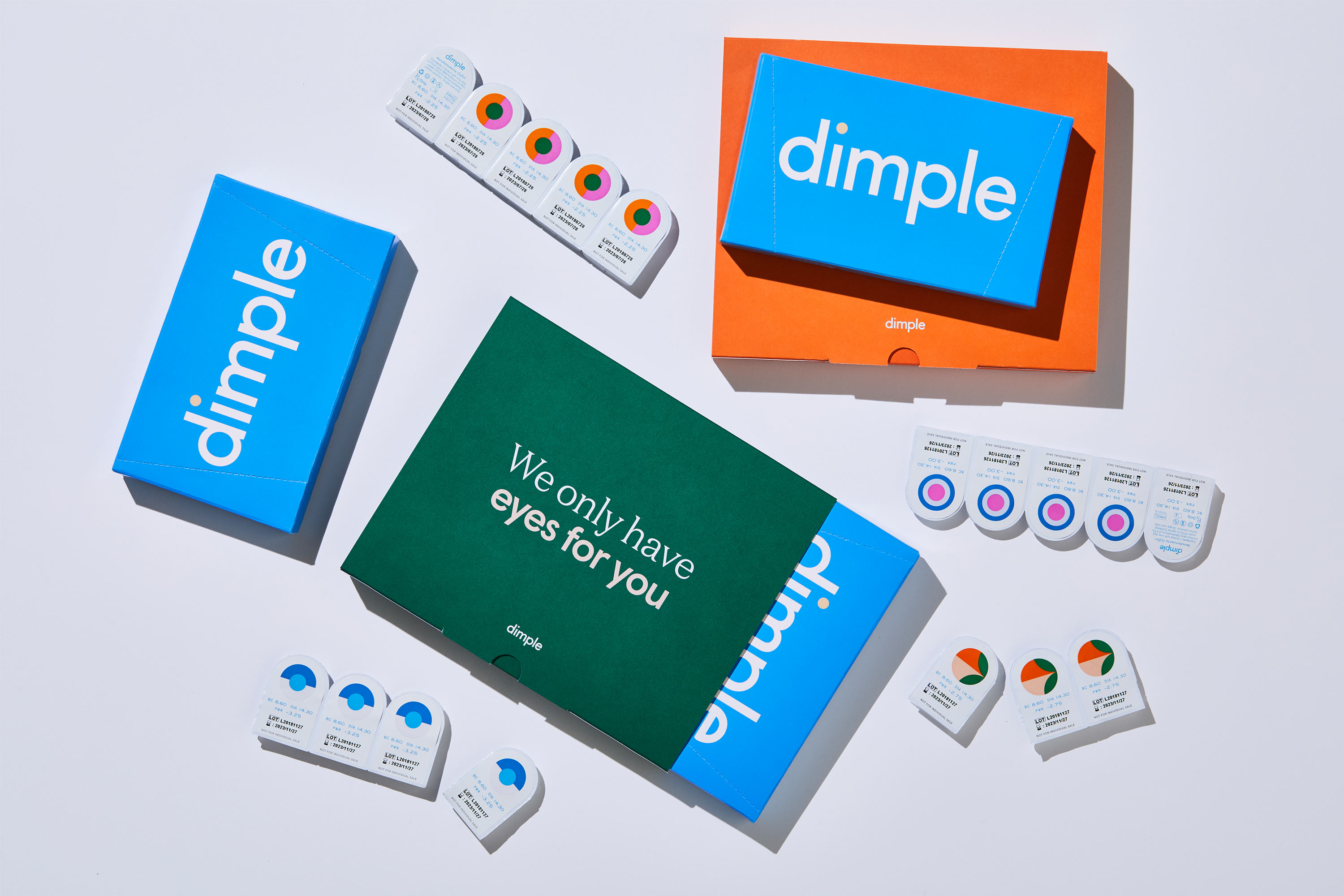
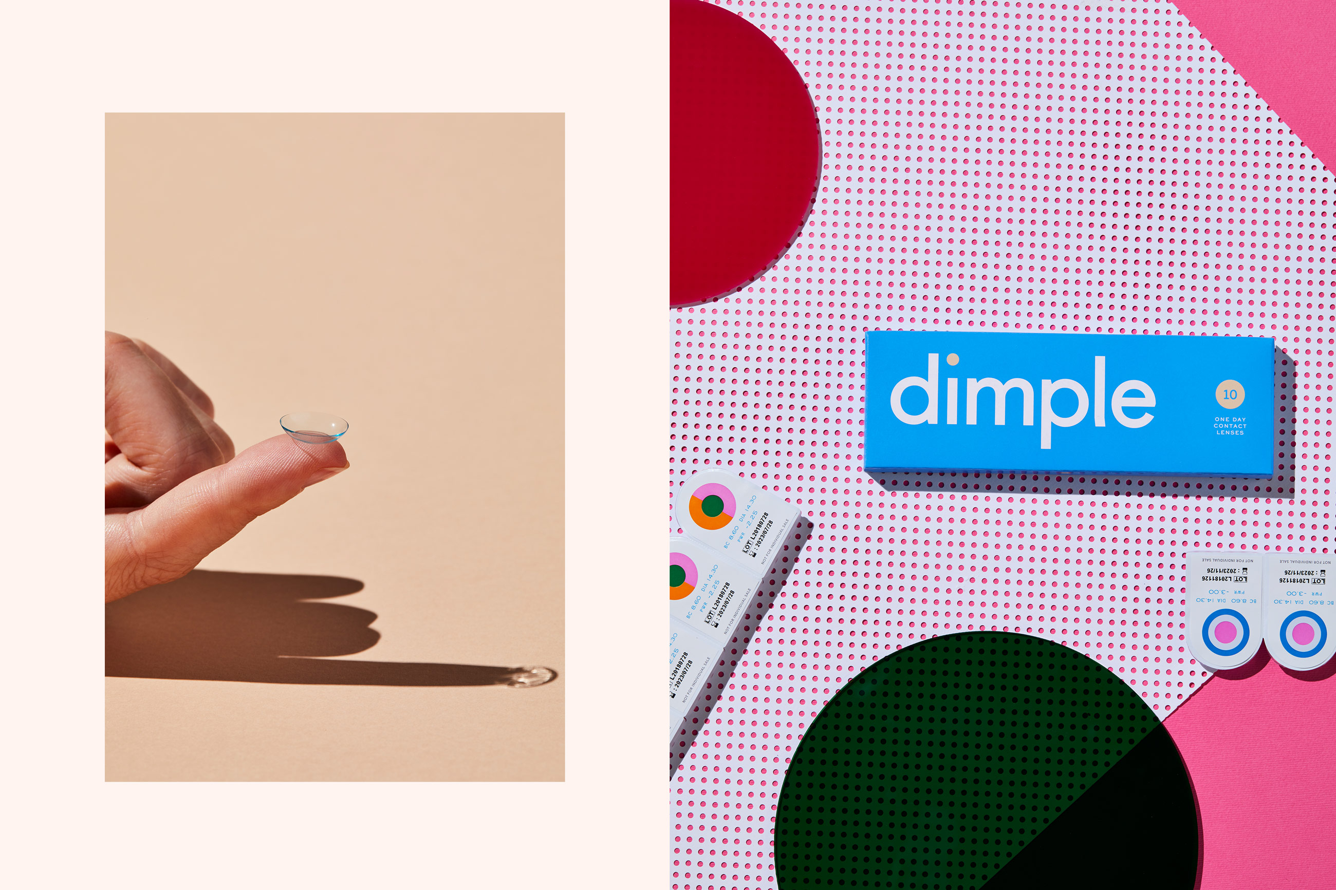
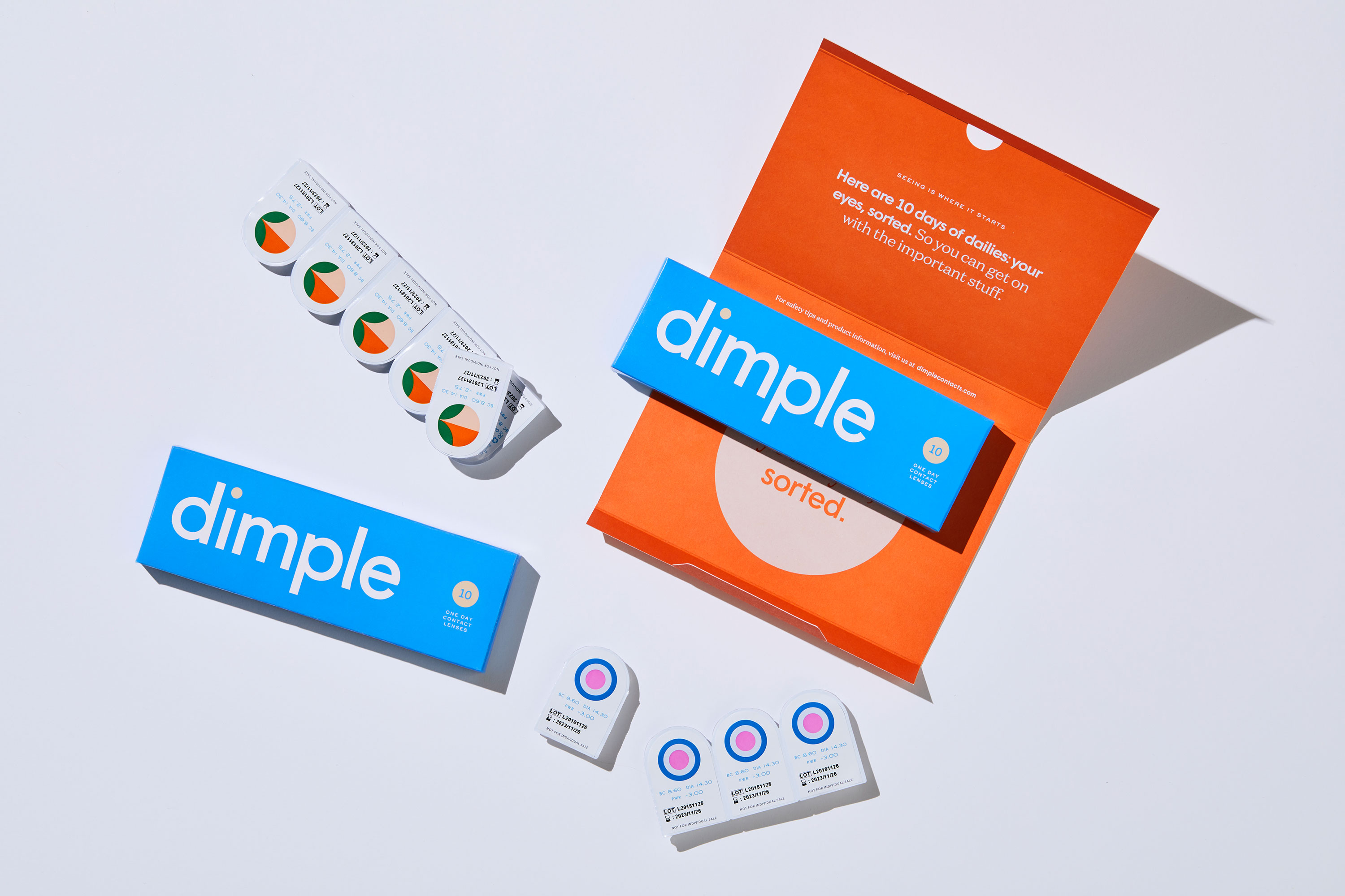
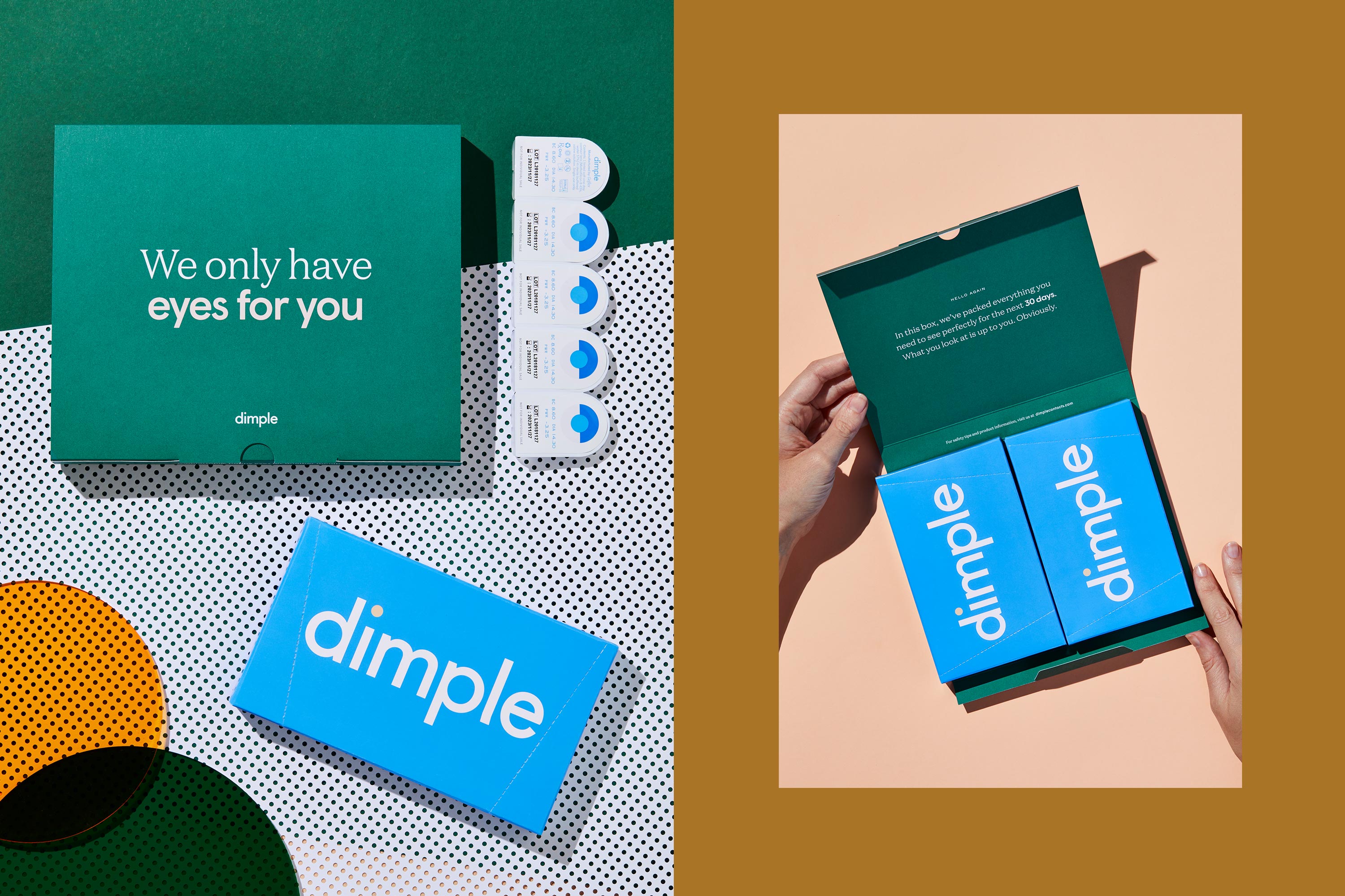
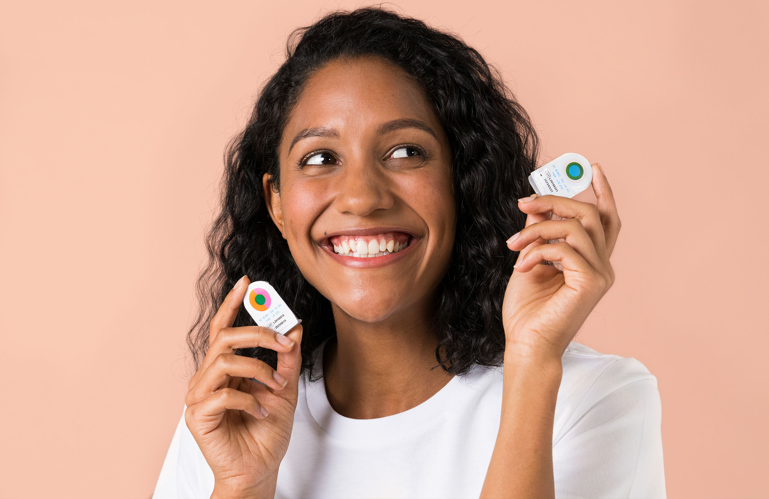
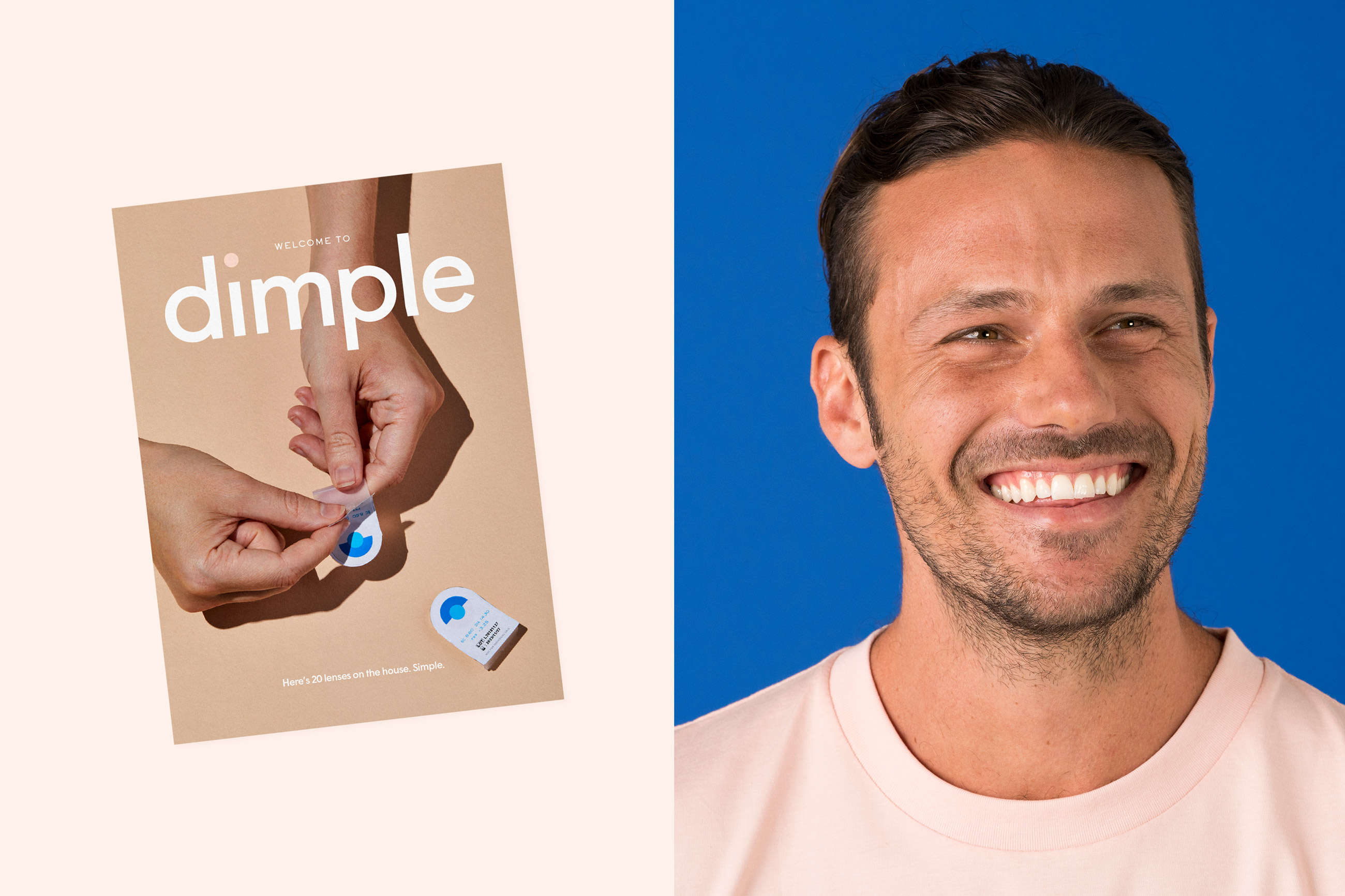
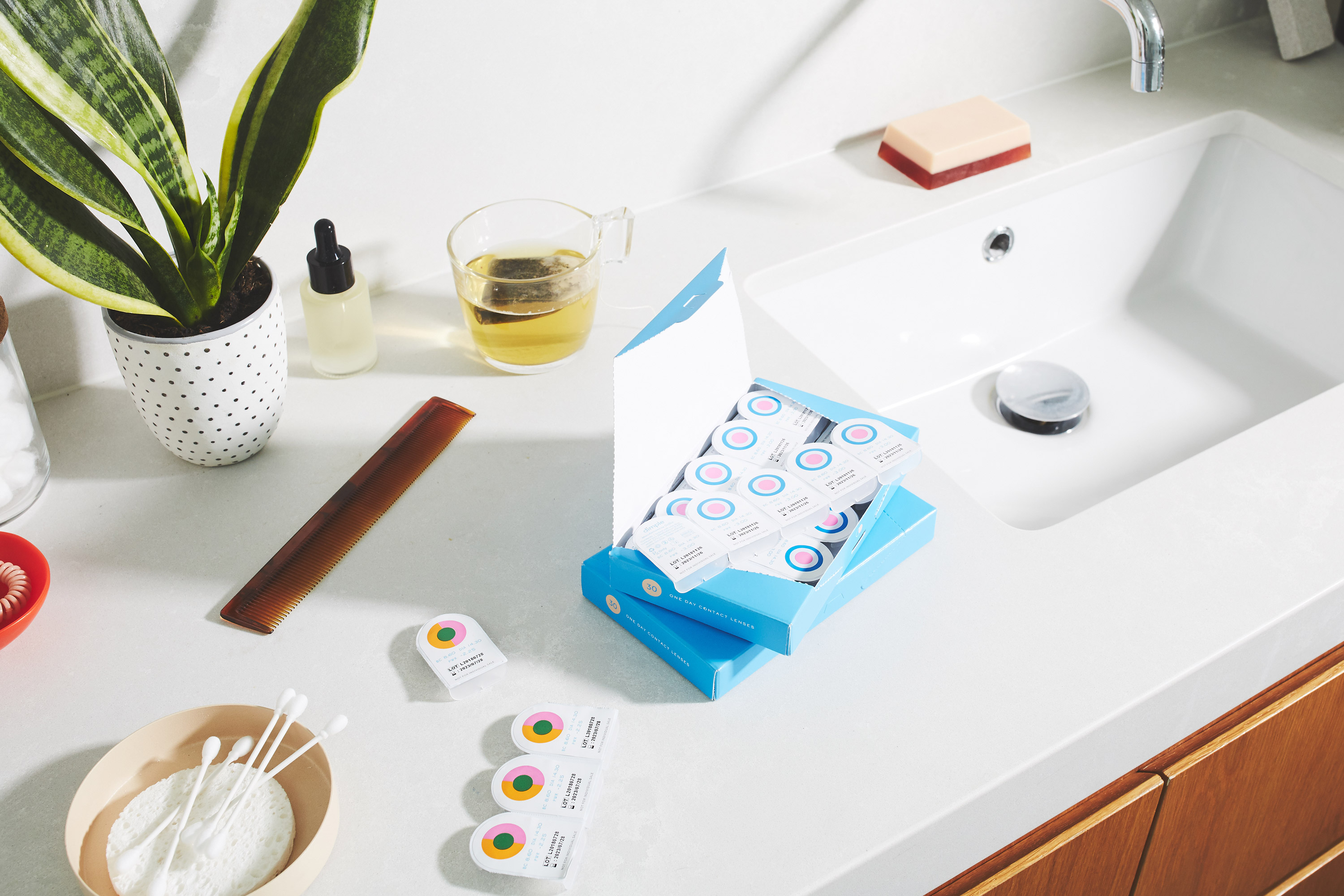
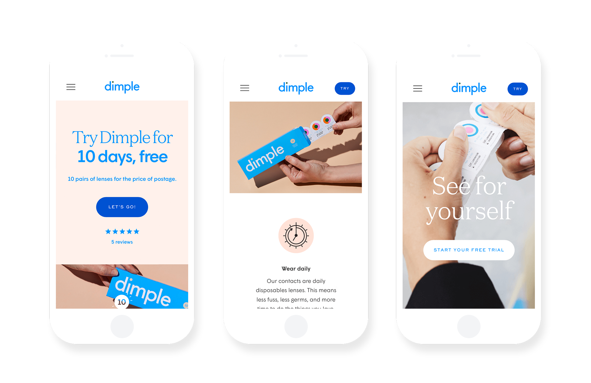
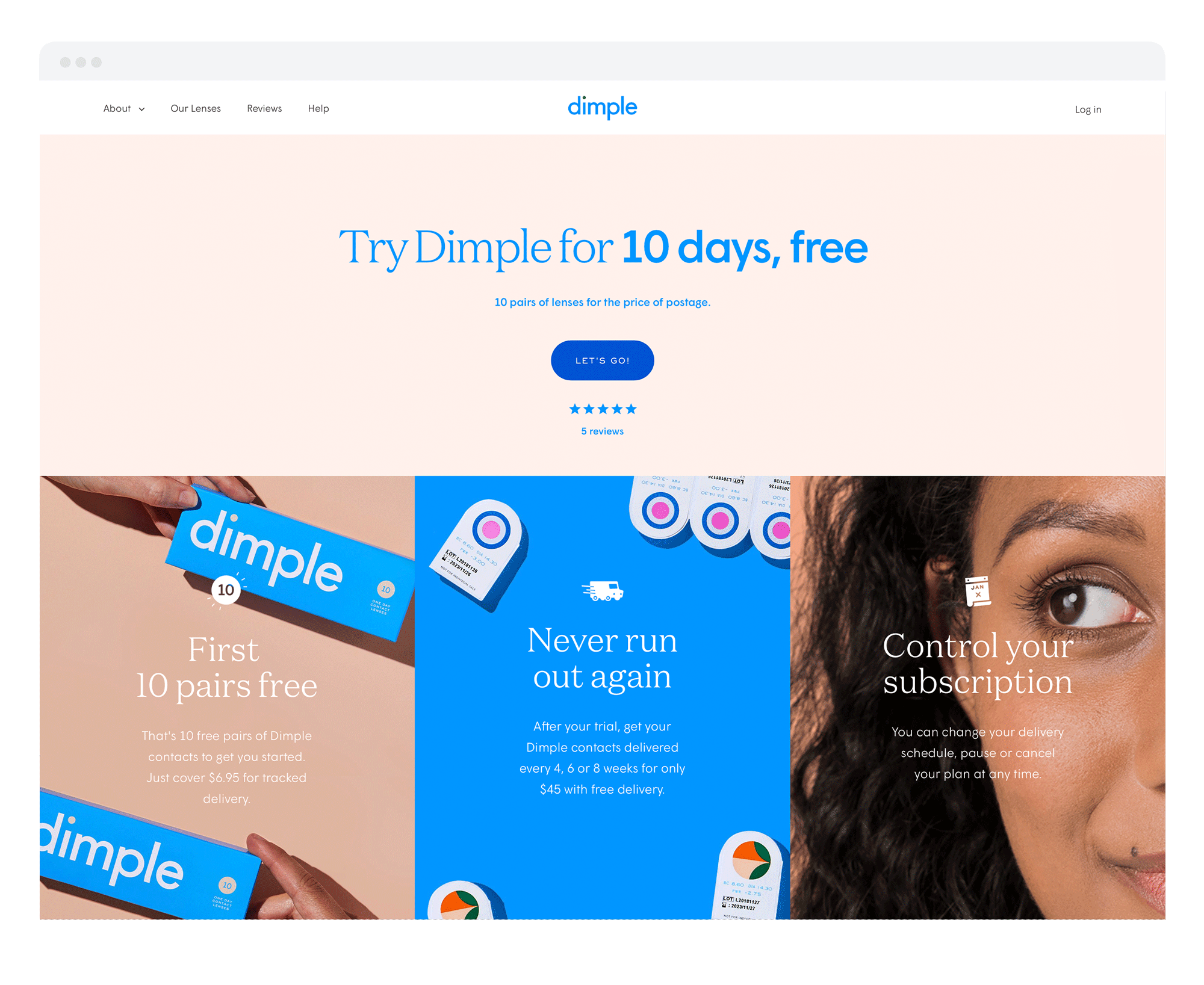
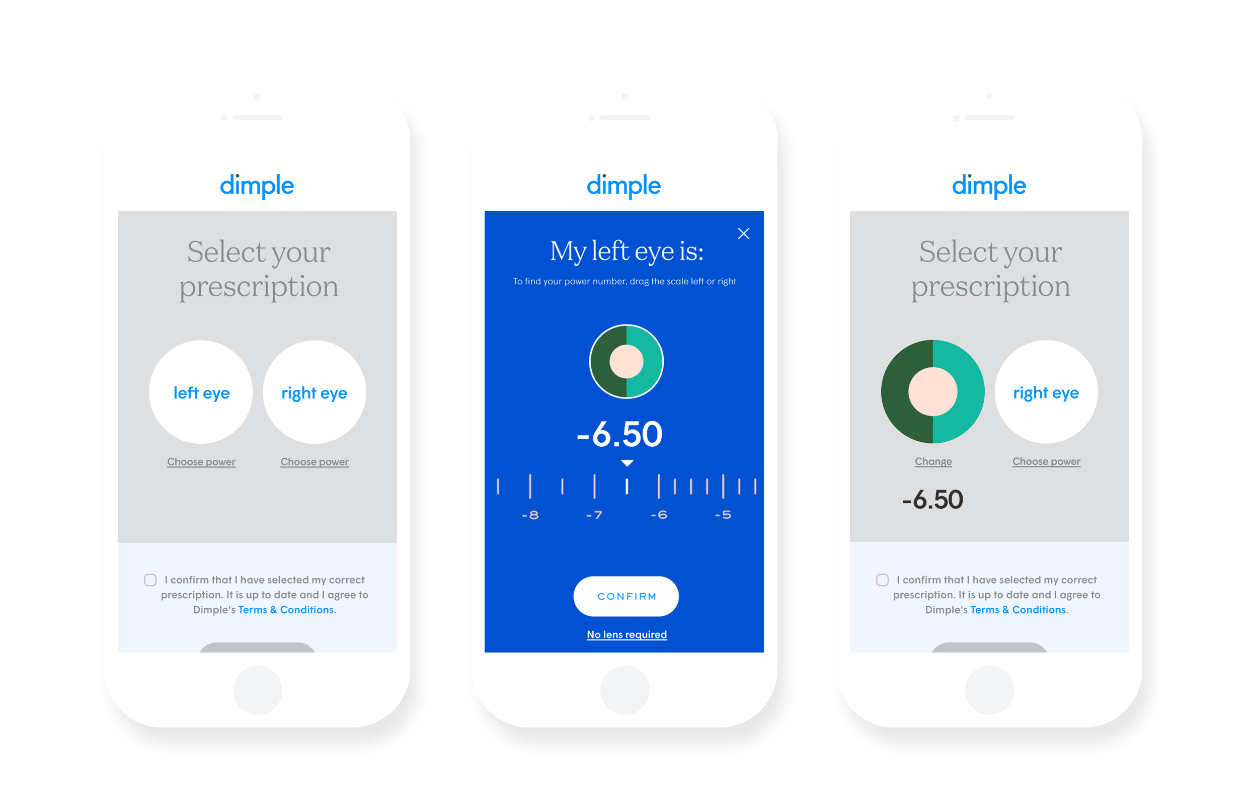
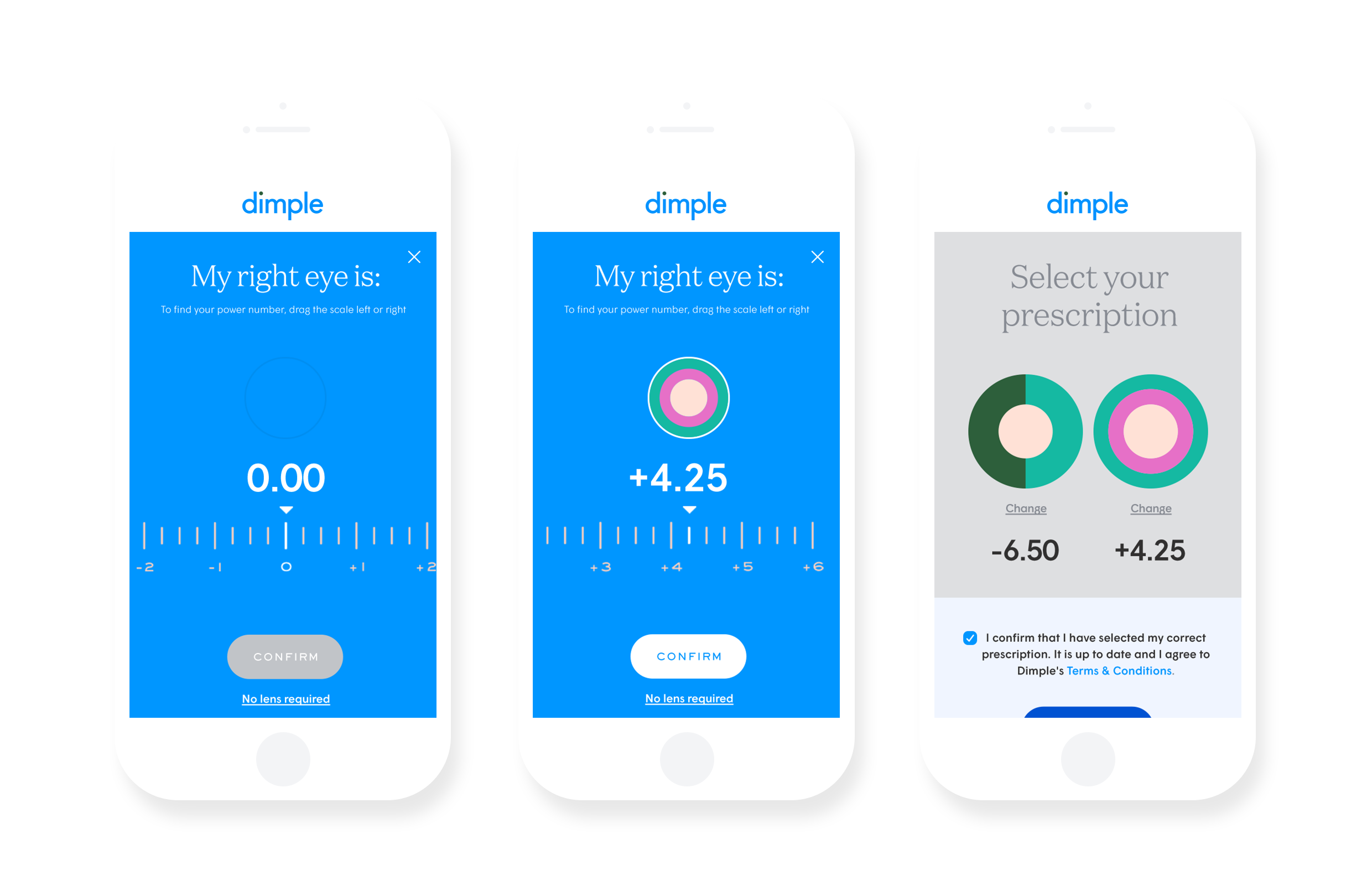
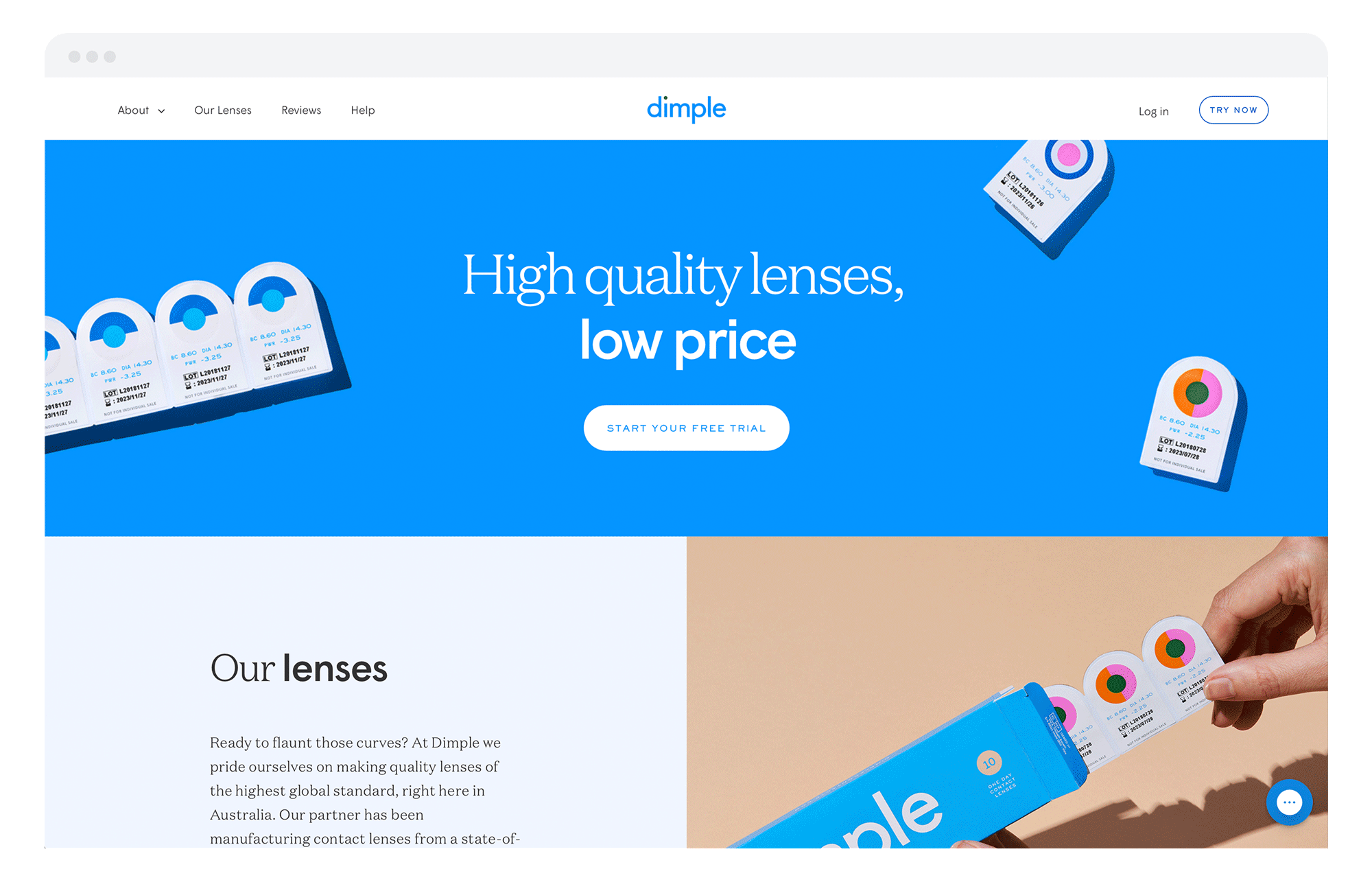
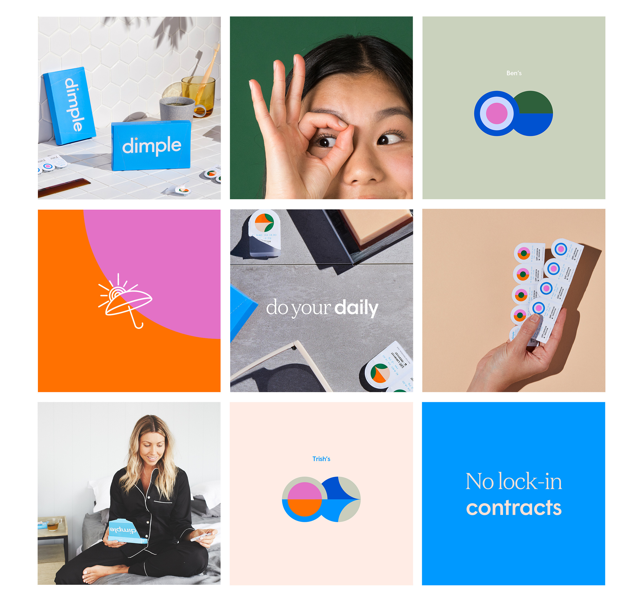
Branding and website design for Dimple, the first direct-to-consumer contact lens service in Australia. The identity concept derives from the fact that, for the most part, everyone’s left and right eye prescription (aka power number) is different. I created a suite of 60 colourful, complementary circles that correspond to each power number (from -12.00 to +6.00) and combine to show the vast number of individual prescriptions. These circles were then printed directly onto blister packs, allowing users to easily identify their left lens from their right (especially when they don't have contacts in). The online experience, from product introduction through to prescription selection and check-out, was designed to be as clear and seamless as possible, while introducing users to the circle IDs in an intuitive, interactive format.
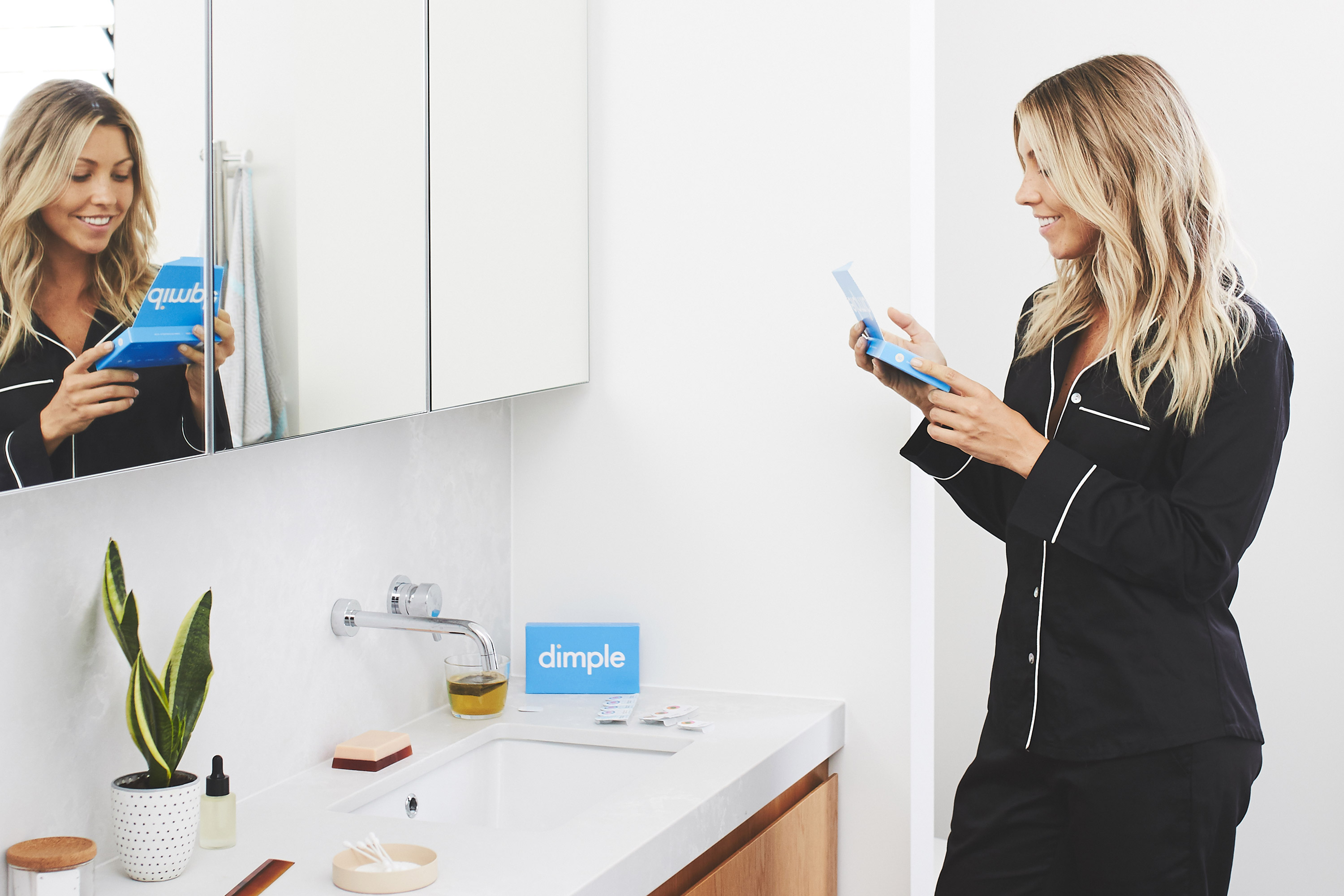
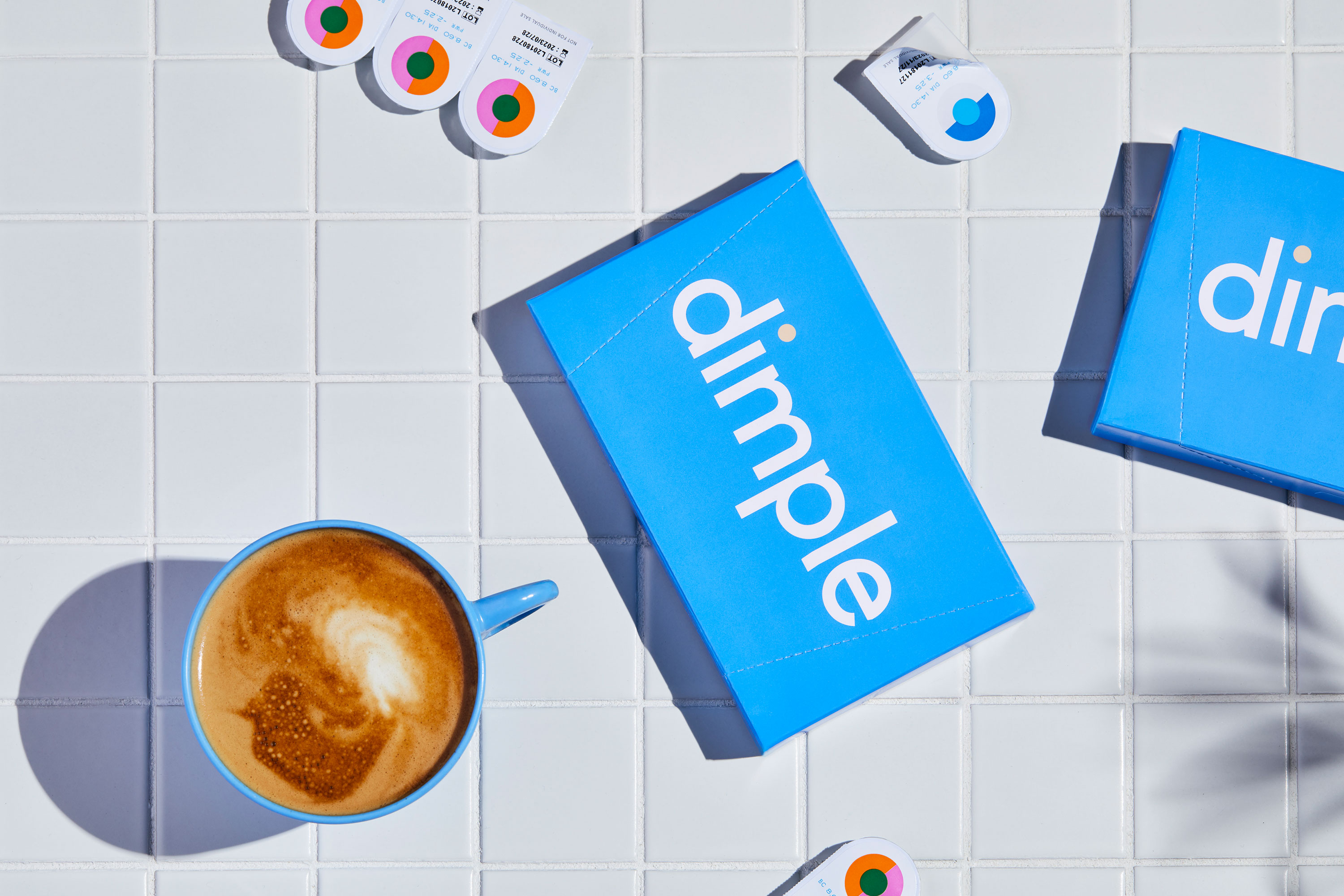
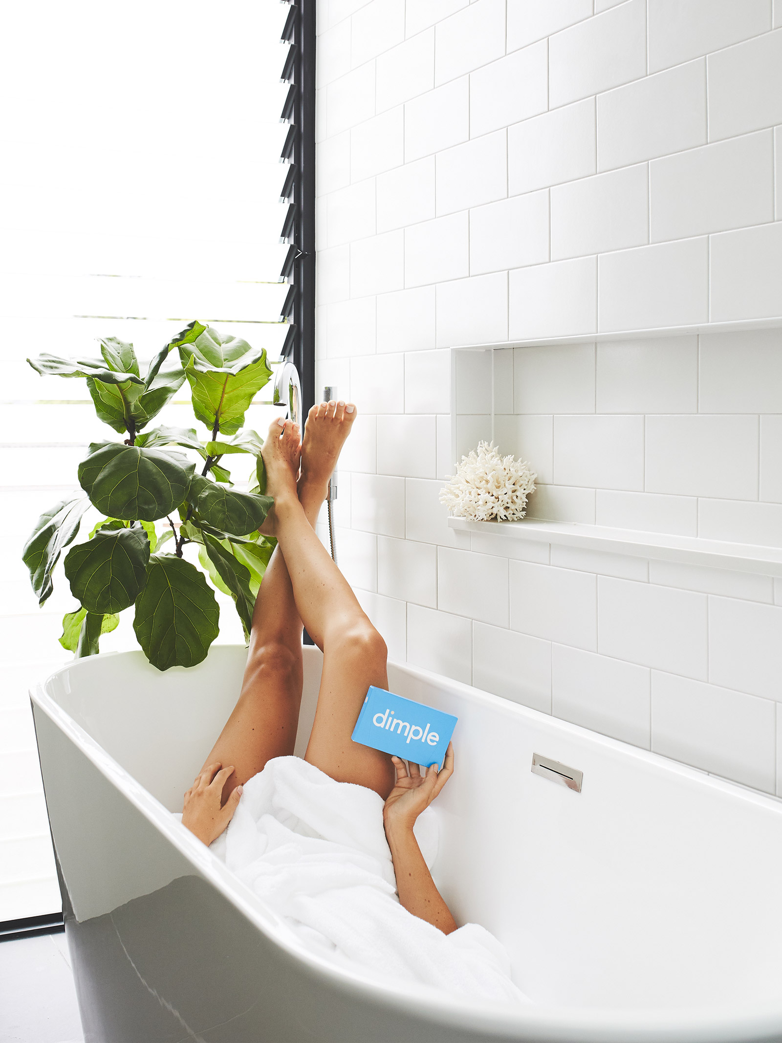
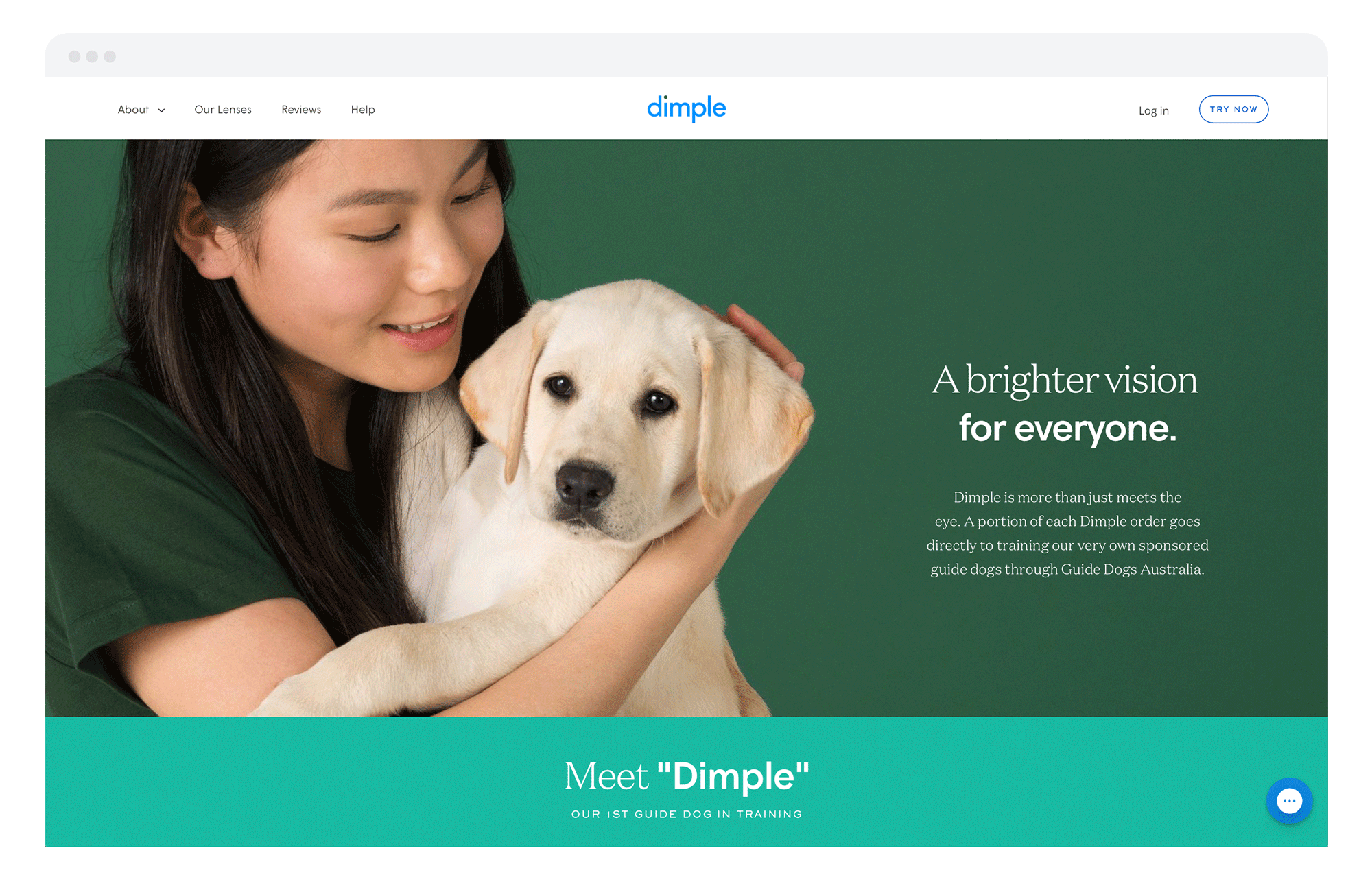
Still life and lifestyle art direction placed Dimple into the early morning routine of the contact lens wearer, with minimal bathroom backdrops and color-coordinated prop styling which featured the brand in a fresh, elevated way. Campaign launch photography centered around the varied Dimple community, and packed more of a visual punch within the brand toolkit's flexible suite of imagery.


STUDIO
Universal Favourite
ROLE
Brand Identity
Art Direction
Packaging
Website
PHOTOGRAPHY
Benito Martin
Jonathan May
Lynden Foss
AWARDS & FEATURES
Good Design Awards Australia (Gold)
AGDA Distinction (x2, Branding, Packaging)
AGDA Judge's Choice, Volunteer's Choice
Best Design Gold Pin (x2, Brand ID, Colour Awards)
The Brand Identity
UnderConsideration: Brand New
Creative Boom
Mindsparkle Mag
The Dieline